Generating The Alphabet
My current generative artwork-in-progress includes text, but I don’t want to use a font. In browser based art work, using a “web safe” font could produce inconsistent results, while including a font file would mean a large file size. Additionally, I don’t want a visual element of the project to be something I didn’t create myself.
Instead of using a font, I made my own path-based alphabet using p5.js and JavaScript.
Fonts, how do they work?
I started by looking into what the various points on a font are called.
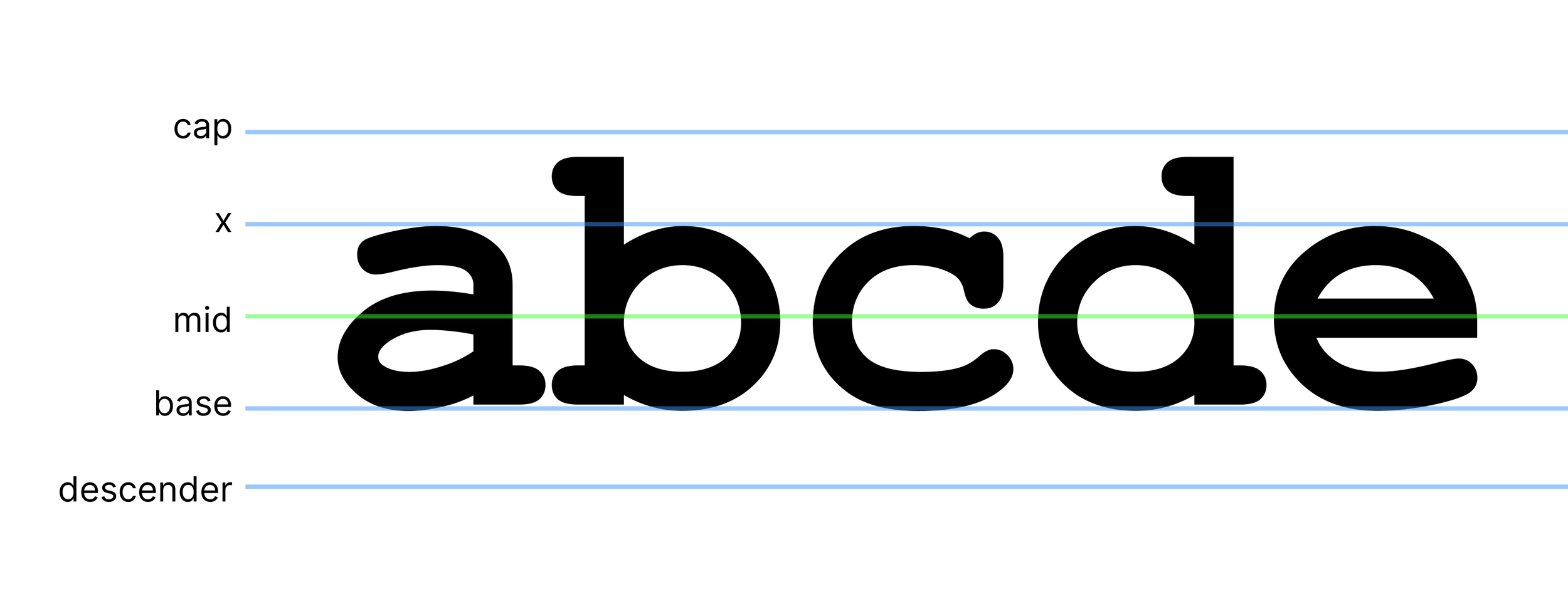
(Mad props to whoever decided that one of the heights in the y-axis of a font should be referred to as the “x” height.)
I defined my letters around a central point, mid_x and mid_y. In hindsight it would have been better to work from a bottom left point and I’ll be adjusting this at some point, to help improve my kerning, which is currently inconsistent.
Within a Letter class, I defined these key locations like x height, cap height etc, in relation to the font size and the mid point. For example, the full height from base to cap is equal to the font size. From y_mid to y_x is 1/3 of the full height.
I also defined some small distances I could adjust a point by, in relation to the height.
this.adj_1 = this.h_full * 0.05;
this.adj_15 = this.h_full * 0.075;
this.adj_2 = this.h_full * 0.1;
this.adj_25 = this.h_full * 0.125;
this.adj_3 = this.h_full * 0.15;
this.adj_35 = this.h_full * 0.175;
this.adj_4 = this.h_full * 0.2;
Defining a Letter
Each letter is defined by a set of initial paths, of just a few points. Creating these paths was an iterative process of nudging them into the right places. I used a font as a vague guide and also wrote letters on paper to see how they “should” look.
The results are a bit of a jaggy scrawl. Don’t worry, there’s more.
create_a(){
  this.paths = [
    [ // stem
      {x: this.x_left+this.adj_2, y: this.y_x + this.adj_4},
      {x: this.x_left+this.adj_3, y: this.y_x + this.adj_1},
      {x: this.x_mid+this.adj_2, y: this.y_x},
      {x: this.x_right, y: this.y_x+this.adj_2},
      {x: this.x_right, y: this.y_base-this.adj_4},
      {x: this.x_right+this.adj_1, y: this.y_base},
    ],
    [ // round
      {x: this.x_right-this.adj_1, y: this.y_mid-this.adj_15},
      {x: this.x_mid-this.adj_1, y: this.y_mid-this.adj_1},
      {x: this.x_left, y: this.y_mid+this.adj_35},
      {x: this.x_mid, y: this.y_base},
      {x: this.x_mid+this.adj_2, y: this.y_base-this.adj_1},
      {x: this.x_right+this.adj_2, y: this.y_base - this.adj_4},
    ]
  ];
}
Curving the paths
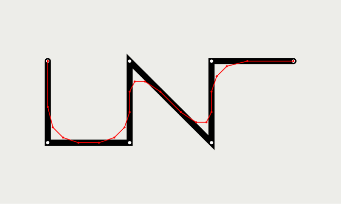
The next step is to smooth out the paths using Chaikin’s curve algorithm. (Shout out to Aaron Penne for making me aware of this algorithm some time in 2022, I think)
Let’s look at a simpler path to see how it works.

Chaikin’s algorithm is run recursively and, in each round, we create a new path with the following steps:
Copy the first point (the ends stay in place)
For the rest of the points before the last point:
Add a point 25% of the way to the previous point
Add a point 25% of the way to the next point
Copy the last point.
After one round, we have this. The new path is marked in red.

Path after 1 round of Chaikin’s curve algorithm
Then we apply the same steps to the resulting path. Here are the results after 2 and 3 rounds.
Path after 2 rounds of Chaikin’s curve algorithm

Path after 3 rounds of Chaikin’s curve algorithm
And here’s the final result.

Satisfying. Let’s see what that does to the letters.
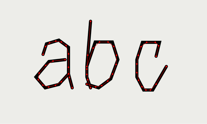
After 1 round of Chaikin’s curve algorithm

After 3 rounds of Chaikin’s curve algorithm

Curved paths
About 3-4 iterations of the algorithm is enough to get a nice curve at small sizes. If the font is to be used larger (with the points further apart), then more iterations will ensure you don’t get pointy edges.
Using Chaikin’s algorithm makes it possible to get smoothly curved paths by only defining a few points.

Minimizing
Defining the paths in relation to the mid point and cap etc helped me figure out how to draw a letter. For example, I found it easier to think, “the stalk of a b starts at the cap and goes to the base”, rather than “the stalk of a b starts 14.1 pixels above the mid point and ends 7.4 pixels below it”.
However, the resulting code was verbose and pretty blergh (as above in the create_a function).
To slim it down, I wrote a function which went through each letter and generated new code with everything translated into simple numeric values.
// Get string of new code
    let string = "";
    for(let l of this.letters){
      string += "create_" + l.letter + "(){\n";
      string += "  this.ip = [\n";
      for(let path of l.ip){
        string += "  [";
        for(let p of path){
          string += "{x: " + nf(p.x, 0, 1) + ", y: " + nf(p.y, 0, 1)  + "}";
          if (path.indexOf(p) != path.length-1) string += ", ";
        }
        string += "]";
        if (l.ip.indexOf(path) != l.ip.length-1) string += ",\n";
        else string += "\n";
      }
      string += "  ]\n";
      string += "}\n";
    }
    console.log(string)
Here’s the resulting code for the letter a. Much smaller.
create_a(){
  this.ip = [
    [{x: -2.8, y: -3.4}, {x: -1.7, y: -6.8}, {x: 2.3, y: -8.0}, {x: 5.4, y: -5.7}, {x: 5.4, y: 2.9}, {x: 6.6, y: 7.4}],
    [{x: 4.3, y: -1.7}, {x: -0.9, y: -1.1}, {x: -5.1, y: 3.9}, {x: -2.1, y: 7.4}, {x: 2.3, y: 6.3}, {x: 5.4, y: 2.9}]
  ]
}
These numbers are based on a font size of 20 and are simply scaled for different font sizes.
Shapifying the path
Here’s the whole alphabet so far. It’s looking pretty natural but it’s also a bit spindly.

It’s easy to adjust the stroke weight, but handwritten letters are not usually exactly the same width all the way along the strokes.
To enable paths with varied widths, I turned the paths into 2D shapes in an algorithm I call ‘shapify’.
To see how it works, here’s that zigzag shape again, after it’s been curved.

To create the shapified path, we go along this path and, at each point:
Find the angle from that point to the next (for the last point, finds the angle to the point before and flip it 180°)
Using Perlin noise, choose the width the path will be at that point.
Here I’ve drawn a line at each point of the path, to demonstrate those angles and widths. Notice how each of the lines is a slightly different length and their angles follow the curve of the path.

From there it’s easy to see how we can draw a path around the inner path to create our variated width path. At the end of the line, it draws a little loop of points around 180° to create a nice round line cap.

I did not know I would be making this weird little wormy guy when I started this article.
Side note: My ‘shapify’ algorithm is not at all perfect. When the stroke width is wide, these awkward inner loops appear at tight corners. It’s the same issue I explored in this article. Luckily, in this implementation the whole thing is filled anyway, so it doesn’t matter too much.

One last thing I did is to jitter all the points slightly using Perlin noise. This adds another layer of natural feeling to the letters as well as giving them variety.
Here’s how the whole alphabet looks:

Aesthetic edits
Now that the system is set up, it’s possible to play around with all kinds of settings to create different effects.
For example, instead of altering the line width with noise, we can do it based on the letter placement. (Thanks to Piter Pasma for the suggestion.)


Or we can mess around with higher resolution noise for more jitteryness.


What does it weigh
My letter class is now 9.7kb. This includes:
Path definitions for all letters A-Z in lower and uppercase, and 7 punctuation marks.
Letter spacing (although I’m still fine tuning this)
Function to resize paths for font size.
Function to create the smooth path by calling Chaikin algorithm (but not the algorithm itself, as that’s a function I also use elsewhere)
Functions to create and draw NaturalLine objects which handle jittering the path points and shapifying the path etc (but not the NaturalLine class itself, as that’s used all over this project)
There are definitely ways I can cut it down more as well. (I am not interested in tips on how to cut down file size at this time, thanks lol.)
When I started defining paths, I was a bit worried I was on a fools errand because I pretty much had to define the whole alphabet before I could really test the look of the results in place, but now that I have it on the WIP outputs, the handwritten effect is looking just how I wanted.


Meaningful Nonsense Prints!
Prints which use an evolved version of this handwriting code are now available!

Each print is unique and generated to order!
If you’d like to keep up with my work, consider joining my newsletter!