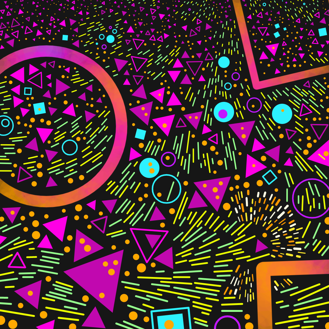
Maplands
Making MAPLANDS
Maplands was initially a paper drawing. When the list of prompts for Genuary came out some time in late 2021, I saw that Day 1 was “Draw 10,000 of something” and I thought it would be fun/funny to do this on paper by hand instead of in code.
I wanted to get an idea of how long it would take to draw that many little shapes, how much space they would take up, and what shapes would be the best to draw, so I decided to do a little test before committing to the full 10k drawing.
This is the sketch I came up with.
At first I was like, well that was cool, and there’s no way I could code it, because there’s too much variation in the layout of the shapes, the way they all don’t touch, the hundreds of human choices I made along the way, etc etc.
About 7 days later I realised that actually a lot of that could be overcome in code, and made these using p5js.
Eventually, over the course of a couple of weeks, this code developed into the final Maplands series.

I did also complete the 10k drawing by hand on January 1st 2022.
Techniques
COLLISIONS
The main technical feat in Maplands is avoiding the shapes touching each other. This is often called “packing” and is often done using trial and error. As a potential new shape is created, we check if it collides with any of the existing shapes and if it does, we throw it out and create another. If it doesn’t collide, then we add it to the array of shapes.
I experimented with several different methods for checking collisions.
Method 1: Comparing pixels
I created an extra canvas/graphicsObject, which would never be seen by the viewer - it’s just used to test for collisions.
To check a new shape, I first drew all the existing shapes to this canvas in red. Then changed the blend mode to ‘screen’, and drew the new shape in green.
Then I would go through each pixel of the canvas and check if any were yellow. If a yellow pixel was found, then I knew that a collision had occurred.
I was quite excited about this method but I found it to be the slowest. It’s possible it could be implemented better though!
Method 2: Geometry
The easiest shape packing is circle packing because you can use very simple geometry to check whether two circles collide. If the distance from the centre of one circle to the centre of the other circle is shorter than the combined radii of the two circles, then they are colliding.

With other shapes though, things get more complicated. You have to check things like whether lines intersect each other and whether lines intersect circles, which all require different functions. I was helped by the fact I’d actually implemented a triangle packing algorithm back in Genuary 2021, so I was able to reuse a lot of that code and thinking.
I wanted to be able to control the padding space between the shapes to create some outputs which are spaced widely, and some that are very crowded. With circles, this is simple because you just add a bit to the minimum distance allowed between each shape, but with triangles, chevrons and squares etc, you need to be able to check if lines and circles come close to each other. This is doable, and I did it, but it’s a faff because every new type of shape needs a different set of functions to check collisions.
I do now have quite a nice set of functions that do things like check if lines are close, and do a bunch of things with angles. I’m planning to tidy these up, create some documentation and release them on github at some point.
Method 3: Points along a line
With this method, each shape has an array of points evenly spaced along its path. To check collisions, I simply check distances between these points.
I saved the stroke width for each point along with its position, so that appropriate padding between points could be given.
Here’s a debug view showing a close up of these points and area they would not allow another point to be within.

Mega shapes were given a wider padding as I found this aesthetically worked well. I also added an extra point at each corner of large triangles, which were spaced slightly further away from the centre of the triangle, as I found otherwise the pointy corners of triangles could touch other shapes at the closest setting.
This is the method I ended up using. It produced the quickest results and it had the cleanest code, as it was reasonably consistent for all kinds of shapes.
SEGMENTS
I also split the canvas into segments which slightly overlap each other and add new shapes or their points to the relevant segments. Then, with potential new shapes, I only need to check the segments it’s in for collisions.
This technique works alongside any of the methods above to (massively) speed up collision checking.
Sometimes this would be done with a quadtree, where the canvas is divided into segments as and when it’s needed, depending on where points are placed and what areas are getting crowded. That seemed unnecessary for this, since the points end up evenly spread across the canvas. So I just created even segments at the beginning and experimented with how many segments gave the quickest results.
I used this line of code at the end of the render, to be able to accurately and clearly see how long my code was taking to load. It helped me check lots of different things I was trying out and see how much they affected load time.
console.log("Load time: " + millis() * 0.001 + " seconds");It’s possible implementing a quadtree would have loaded the code quicker, but I ended up with load times of around 1-2 seconds (maybe a little more on slower machines) and I was fine with that, especially once I made a nice loading animation.

Don’t stare this for ages. It’s literally just the loading animation. Nothing is going to happen. lol.
Colours
I use a variety of tools to create and manage colour palettes.
Coolors is a regular favourite of mine.
I love the accessibility of the Google colour picker. (Simply google “colorpicker” to use it.)
I do all my coding in Atom and use a plugin called Pigments, which highlights hex codes in the appropriate colour. It makes it easy to identify stuff at a glance, as well as making my code look cool.

In this project though, I also tried something new, which worked really well.
I created a small mock up of a Maplands output in Figma, and used it to create the colour palettes. Here’s how that looked when they were all created.

One super useful thing about Figma is that you can group shapes together and then change the colour for the whole group, making playing with the palettes really quick and easy.
It also enabled me to easily see all my colour palettes next to each other and see whether I had a good range of possibilities.
Settings and Sizing
As a general rule, I put all my settings in an object which I like to call sx because it is easy to type.
All sizings are selected based off the dimensions of the piece, so that everything scales to the browser window it’s viewed in.
So I would never write:
sx.circ.dia.min = 10; // nopeInstead, I’d always write:
sx.circ.dia.min = dim * 0.01;Feature and chance distribution
(This could probably be its own blog article but I’ll just touch on it a bit here)
There are lots of ways you can choose an option, here are a few:
Even distribution.
The most simple.
e.g. random(8, 25) will give you results evenly distributed between 8 and 25.Weighted distribution using maths.
Using all kinds of different mathematical functions, you can adjust the results of a random() call to be weighted to different parts of the distribution.
This sketch I made shows some examples, using functions from easings.net that are actually intended for animation.Manually weighted distribution.
With sets of discrete options (e.g. palettes), different weightings can be given manually to different options.
This sketch demonstrates my weighted choice implementation.
I have an array called options which holds several inner arrays. In the inner arrays, the first item is the option and the second is the weighting.
The weightedChoice() function takes this array and creates a new one, holding all of the options. Each option is added to the new array a variable number of times, based on the weighting. i.e. an option with a weighting of 10 gets added to the array 10 times. Then the function chooses randomly from that array. Options that were added more times are more likely to be chosen.
I like to use the manually weighted distribution option for features. I like how having discrete options enables me to influence the variations across the whole series, and how it makes the differences between different options clear, and also it lets me name those options.
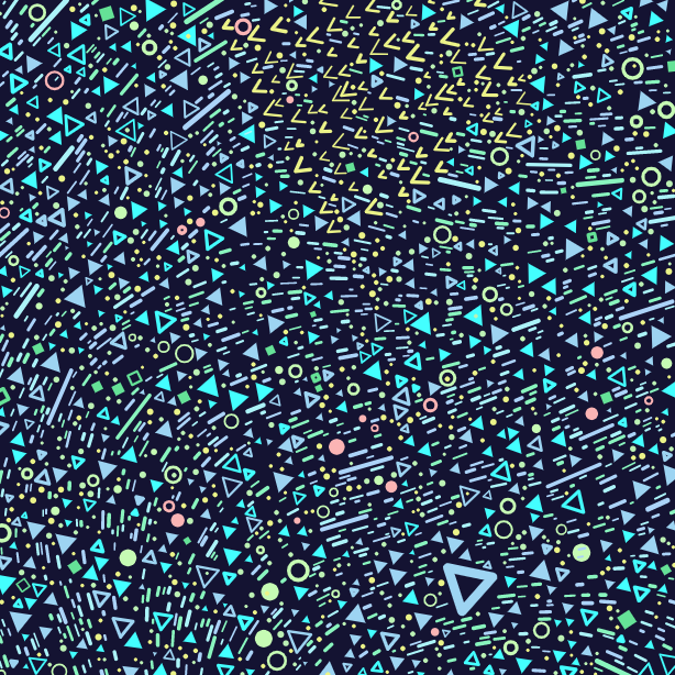
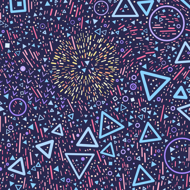
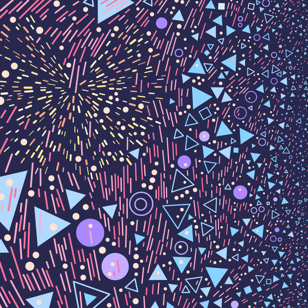
For example, here are the possible settings for the shape distribution (the resolution of the Perlin noise field that is used to decide which kind of shape to draw in a given location).
shapeDistribution: wchoice( [
  [{res: 0.05, name: "very scattered"}, 2],
  [{res: 0.01, name: "scattered"}, 3],
  [{res: 0.002, name: "smooth"}, 5],
  [{res: 0.0003, name: "very smooth"}, 2]
])
The numbers at the end of each line (2, 3, 5, etc) are the weightings for each option.
If I had just used:
random(dim*0.05, dim*0.0003);this would give a random, even distribution between those two numbers, resulting in much less definition between the different options. Plus it’s nice to be able to give things names for the feature output on fxhash.
FEATURE Guide
Lets go through each of the features and talk about how they affect the outputs!
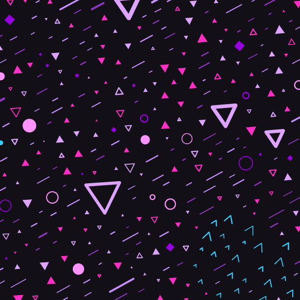
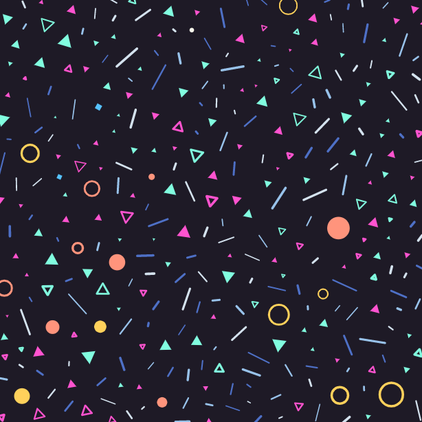
Palette
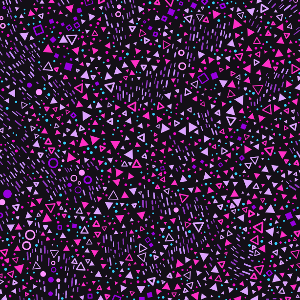
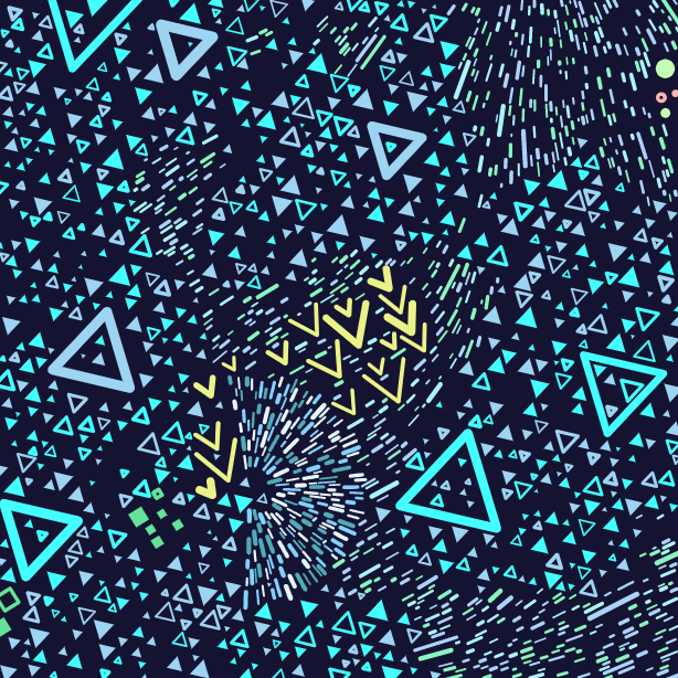
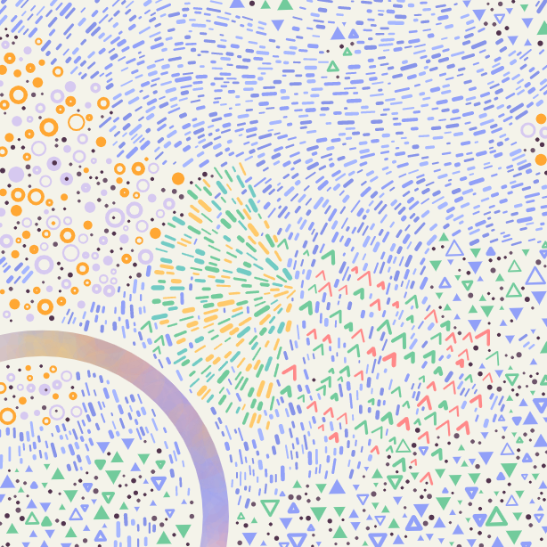
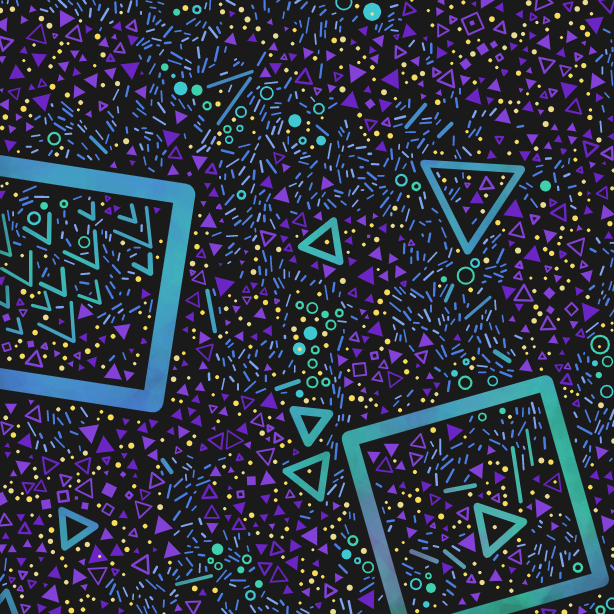
There are 11 palettes in total, and they have a weighted distribution. Here is an example of each, from most common to most rare.
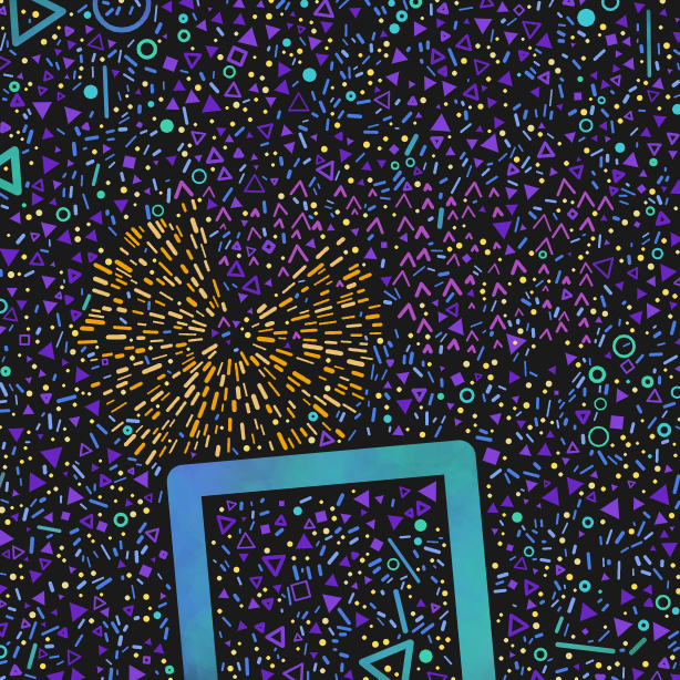
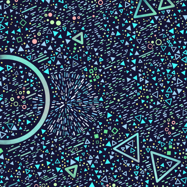
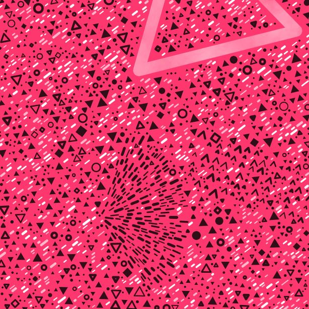
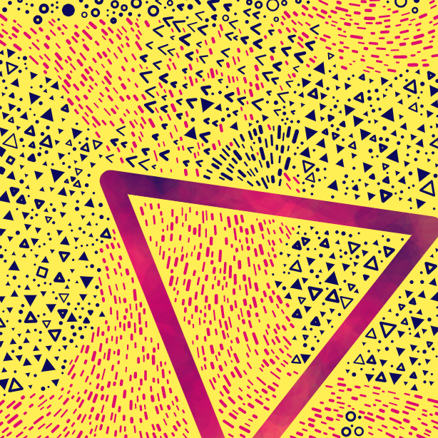
Some palette tidbits-
Test case scenario is based on the ‘placeholder’ colours I was using when I first developed and tested this series - hence the name.
uhhhhhh should be read as in a stunned, “uhhhhhh, omg, are you seeing this?”
Lavender fields is a nod to my lovely Dad, who passed away in October and who used to give me lavender to smell when I was little.
Puddle jumping is a Spring like palette, and the name is the first thing that popped in my head when I thought about Spring.
Hypercolour is inspired by those t-shirts that changed colour in the heat in the 90s
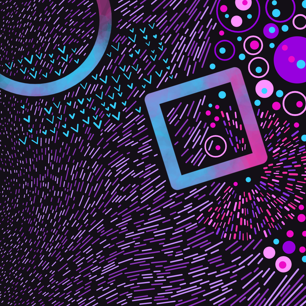
Large shape texture
This feature has two options, watercolour and flat. In the first image the large and mega shapes have a (generated) watercolour texture, and in the second image the colour is flat.

Watercolor - #4

Flat - #2
Seeing those watercolour fills for the first time was one of the moments in developing this project that got me super hyped.
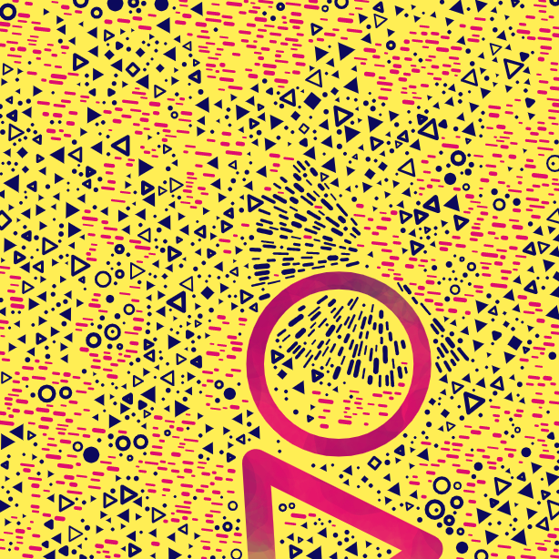
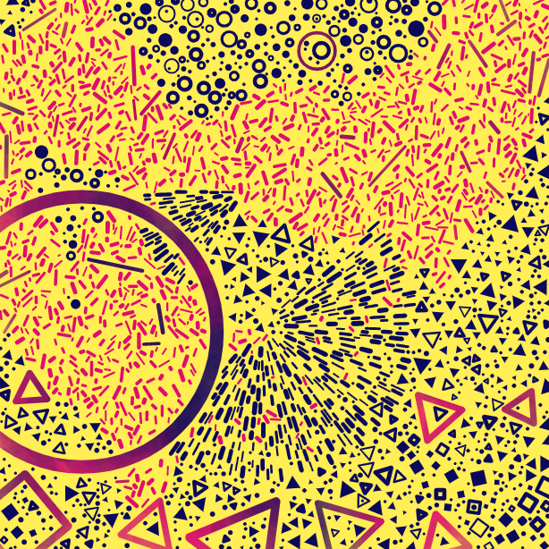
Color selection
My first plan was to give each type of shape its own colours, e.g. in the Acid Replay palette (seen below), the circles are cyan and purple, the triangles are pink and purple and the dashes are green and yellow.
As an alternative to this, I created a mode where the colours were chosen in patches, with the use of a Perlin noise field. This mode is rarer and only 14 with that option came out in the collection.

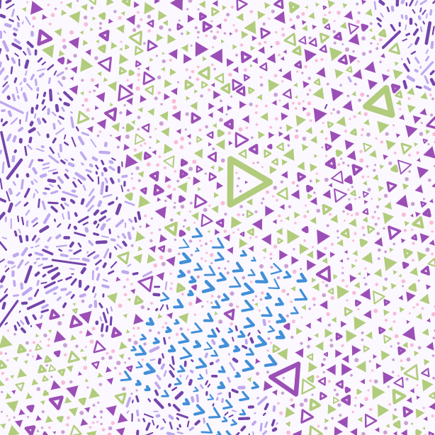
By shape - #45

By location -#136
n.b. In both of these options, the watercolour fills, the dots and the bursts (the areas of lots of dashes exploding outwards) keep their own colours.
Spacing
This controls the minimum spacing distance between the shapes and there are 6 different options. Here they are, from closest distance to widest.


Looking back, this is one thing I would adjust if I was doing this again. I think there could be more difference in the results between the first four options, due to the fact that other factors also affect the overall crowdedness of the piece (such as shape direction alignment).
Still, it’s good to have things to be aware of wanting to work on, and I really like the difference between the ones that are noticeable spaced out versus the closer ones. I think it added a really interesting vector to the variety of the collection.
Doodle distribution
There is an order to generating the shapes. First any mega shapes get created, as otherwise it would be difficult to fit them in around lots of smaller pre existing shapes. Then any bursts and chevron areas. Then the bulk of the generation is making circles, squares, triangles and dashes. Then lastly the dots.
During the main phase of creating the circles, squares, triangles and dashes, a location for the shape is chosen first and then that location determines which kind of shape is created. This is done using a Perlin noise field to create cloudlike areas of different shapes.
I used four different options for the resolution of the noise field, to create different kinds of areas of shapes.
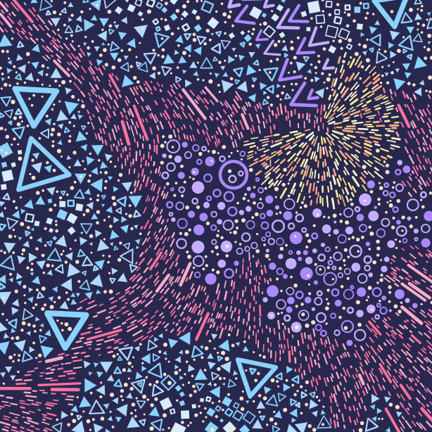
In the smoothest option, the resolution for the noise field is a very small number, meaning that from one side of the canvas to the other, we don’t move very far through the noise field. This means that large areas of the same shape appear.
In the most scattered option, the resolution is high, and from one position to another, we take large leaps through the noise field, resulting in lots of different shapes appearing next to each other.
I love the way the smoother options create landmass/river effects, while the scattered options have a chaotic feeling to them.
Dash angles
The angle of dashes is also chosen using a Perlin noise result at the dash’s location.
Once again, there are four options for the resolution of this noise field, from completely chaotic, to some loose cohesion, to a nice smooth curve, to completely aligned.

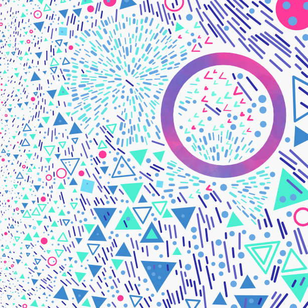
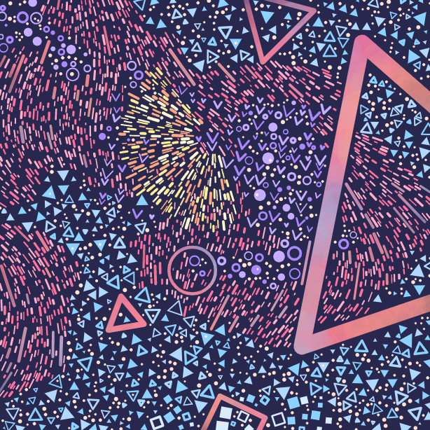
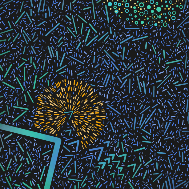
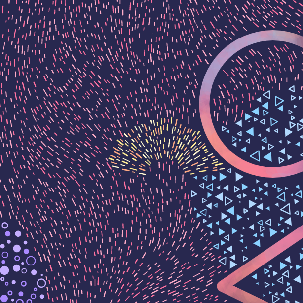
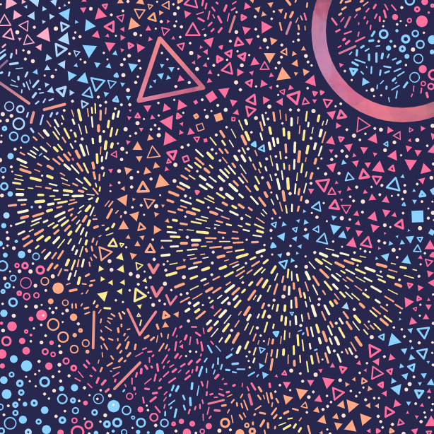
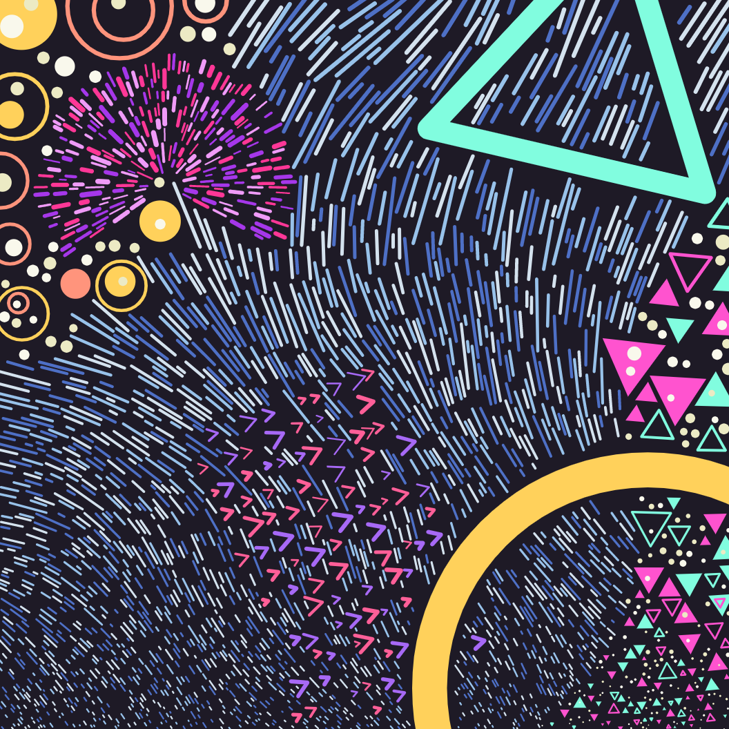
Bursts
Bursts are the areas of dashes which explode out from a centre. It’s possible for a piece to have 0, 1 or 2 of these areas.

Chevrons
Chevrons are created just after bursts and not alongside other shapes like triangles, circles etc. This was just a creative choice I made so that the chevrons could be in a specific area, and not get lost amongst the triangles.
They are laid out in an angled grid of rows and columns but their positions are jittered around a bit, and some chevrons are deliberately omitted, so the grid layout is quite loose. This is because I noticed that when I made the initial paper drawing, I laid out some shapes in grid areas, and I liked the effect.
I also made a global chance for chevrons to be created large, resulting in three possible settings for chevrons -

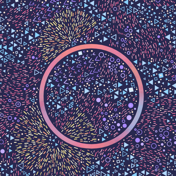
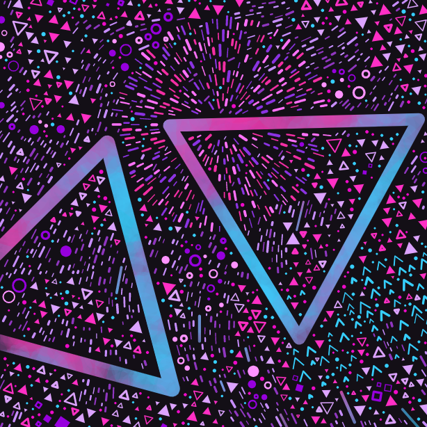
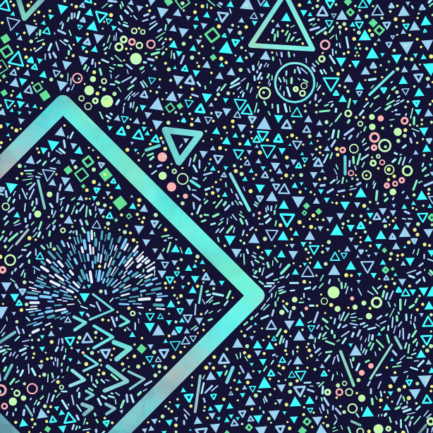
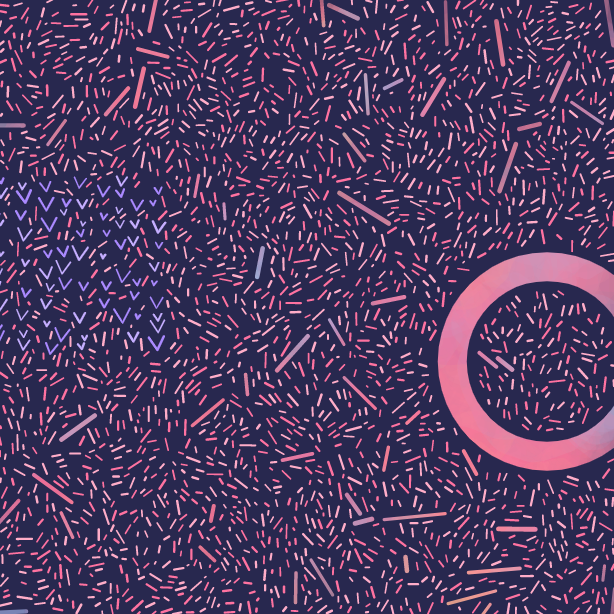
Mega Shapes
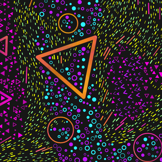
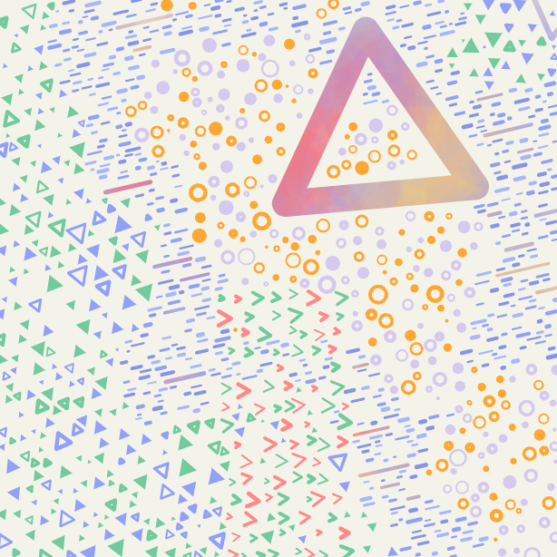
The ‘mega’ shapes are the very large ones that span roughly half the canvas width or more.
In the settings in the code, the number of potential mega shapes is an integer from 0-3. However, when a piece has 3 potential mega shapes it can be hard for them all to fit in. The code could get stuck for a long time trying to find space for them all, so after a few attempts it just moves on. Since the features need to be displayed before the shape generation code is run, it wasn’t possible to know the number of mega shapes that would actually show up. Therefore, I simplified this feature to display as simply on or off.

Mega shapes on - #200

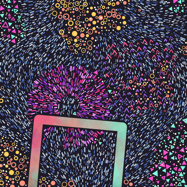
Mega shapes off - #226
Those triangles in the second image above are not “mega” shapes, they are “large” shapes, which are different…
Large shapes chance
As every shape (aside from mega shapes, dots or bursts) is created, it has a chance to be a large shape, which means it’s bigger than a regular shape but not as big as a mega shape.
The combination of large shapes and mega shapes gives a lot of variety in the resultant size of shapes in the compositions, without it being evenly distributed from small to large shapes.
Each piece has a global “chance” that an individual shape will be a large one. There are three options for this chance -
When the chance of a shape being large is 10 or 40%, we don’t actually end up with that percentage of large shapes. This is because large shapes are much more likely to collide with another shape (simply because they take up more space) and therefore get thrown out.
Size gradient
When this mode is on, the size of each shape (aside from the mega shapes and the bursts) is adjusted based on its position, creating a gradient from small to large shapes across the piece.
This idea was on my mind (and my post it notes) for a while, but I didn’t get around to trying it out until just a few hours before I dropped Maplands. As soon as I saw the results I knew I had to get it ready to ship.
I was worried that introducing a whole new feature so last minute was a bad idea, but I made sure to backup my code so that if I messed everything up, I could roll back easily. In the end I managed to set it up pretty quickly and I had time to run several test exports of a full set of 256 to check that everything was working correctly.
I’m super glad I took the chance to implement this idea as it can create such a flow and dynamism to the piece that I find super appealing. I made it fairly rare (there are 25 like this in total) because I wanted it to be special.
Conclusion
Developing this project is some of the nicest time I’ve had making art for a while and especially in such a poop time generally, that has been a real treat. Dropping on fxhash is a pleasure, especially with the community that’s built up in the Discord being so supportive and friendly.
I also want to give a shout out to the folks in the GenArtClub slack, who gave me super helpful feedback, tips and ideas during the development of this project.
I hope you enjoyed reading a bit more about Maplands. Feel free to drop me any questions and I’ll try and get back to you.
This article was created with help from Zancan’s tool to filter the outputs so I could find ones that exemplified each feature and Mark Knol’s tool to download the full set of thumbnails.